
Creating a Mobile Friendly Web App
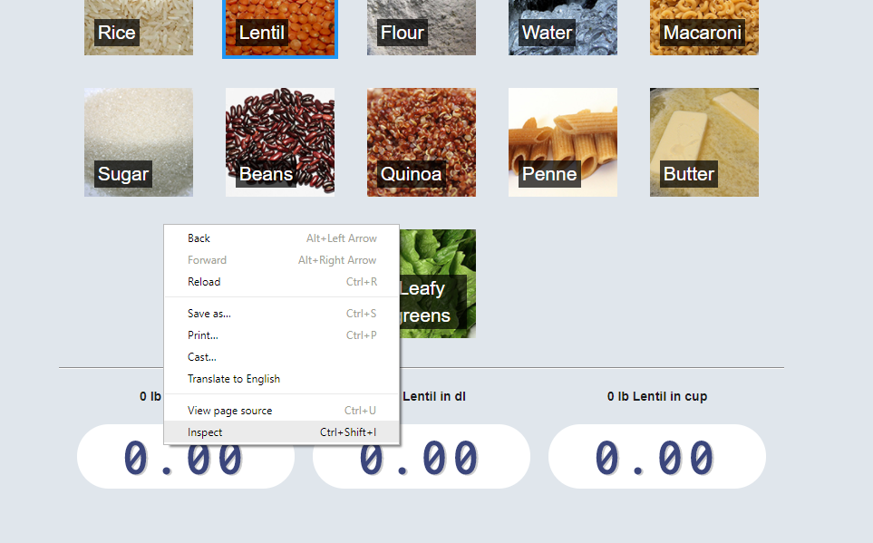
16 Sep 2017If you want your website to work well on a mobile device there are a lot to consider. My latest project was made with mobile devices in mind. It is a simple cooking converter for recipes. Recipes might use an inconvenient or unfamiliar unit of measurement for an ingredients, such as cup or pound ( At least these units are inconvenient where I live). Having a way to convert the measure while being in the kitchen, cooking, would be nice. The tool was, therefore, made to work well on mobile devices. Below, I’ll mention a couple of tricks that can make your web app work better with mobile devices.
Home Screen App Icon and Short Name
Having a custom image and label on your users’ home screens is a good thing. There are many favicon generators out there. This one works well. Upload your icon and you get favicons suitable for iOS, Android and Metro. Add all the favicons to your project, and add something similar to the code below to your page’s head element:
<link rel="apple-touch-icon" sizes="180x180" href="/public/images/cooking/favicon/apple-touch-icon.png">
<link rel="icon" type="image/png" sizes="32x32" href="/public/images/cooking/favicon/favicon-32x32.png">
<link rel="icon" type="image/png" sizes="16x16" href="/public/images/cooking/favicon/favicon-16x16.png">
<link rel="manifest" href="/public/cooking/favicon/manifest.json">
To improve the label your app will get on the home screen of mobile devices, add two additional elements to your head:
<meta name="apple-mobile-web-app-title" content="Cooking">
<meta name="application-name" content="Cooking">
Mobile-detect
Mobile-detect is a nifty JavaScript package that allows you to identify the device by the User-Agent string of the device’s browser. Using this, you can easily detect if your web app is running on a mobile or tablet device or not, and customize the UI to a particular form factor. For instance, render selectable items in a grid or a carousel depending on what device the user has:
  import MobileDetect from 'mobile-detect';
  ...
  const md = new MobileDetect(window.navigator.userAgent);
  if (md.mobile()) {
    return this.renderFoodSliderItems()}
  }
  else {
    return this.renderFoodItems()
  }
Media Queries
Media queries are great for responsive web apps, and simple to use. It enables you to apply specific CSS styling depending on characteristics of the device. For instance, if the device’s viewport width is less than 800px, use a smaller font size.
p {
  font-size: 4em;

  @media (max-width:800px){
    font-size: 1.5em;
  }
}
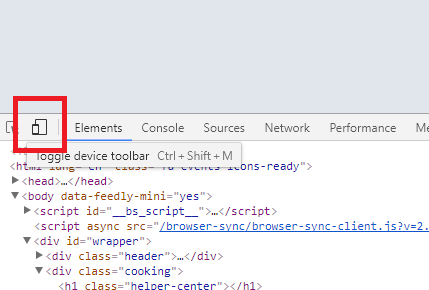
Preview Layout in Chrome’s DevTools
Chrome devTools offer Device Mode, which enables you to test your responsive web app. See how it would approximately looks on a mobile or tablet device. This is a very nice feature to have when you’re developing a mobile web app. To enable Device Mode, do:
-
Right click in Chrome and select Inspect, to start devTools.
-
Click the icon towards the lower left corner, which depicts a mobile and tablet device.
-
Refresh page to allow any web optimizations you have added, to load.
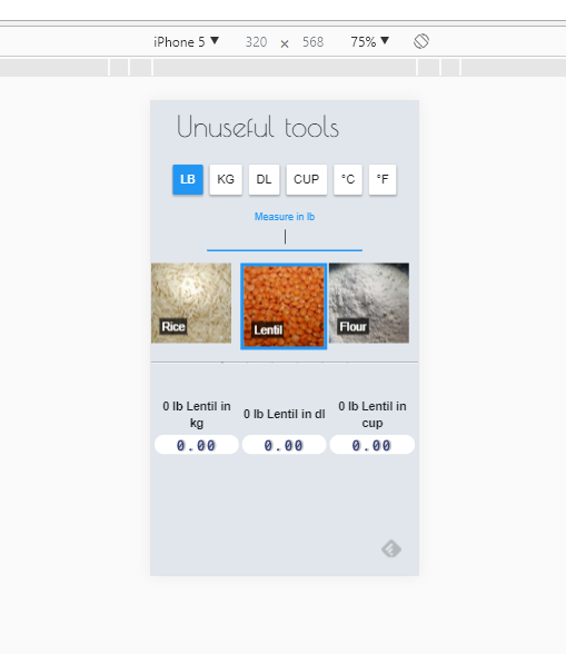
In this view you can see how your responsive web app will behave in different resolutions. It will most likely help you keep your development feedback loop short and sweet.
Please take a look here if you want to see how mobile-detect, media queries, and favicons and metadata were used to create a somewhat mobile optimized web app.